Branding Services
Match the testing experience with your user experience.
Overview
The Visibly service can be branded to better match your brand guidelines and user experience.
Since the test is considered a medical device, only specific portions of the interface not related to the user testing experience can be customized.
This section of the guides goes over what portions of the experience can be branded, and what resources we'll need from you to make it happen.
If you'd like to customize your branded experience, please reach out to your customer success associate.
Customizable Options
Below are the following options available for customization along with what information we'll need from you to build it.
Logo
What We'll Need | What it Impacts |
|---|---|
An image of your logo in .png format which:
|
|
Good

Bad

Header
What We'll Need | What it Impacts |
|---|---|
Hex code for the header background color. This color will be behind your header logo, so we recommend that it highly contrasts your image. | Header background color |
Hex code for the text on the header. We recommend white for the text color if using a dark header background and your primary accent color for a light background. | Header text color |
Good

Bad

Footer
What We'll Need | What it Impacts |
|---|---|
Hex code for the footer background color | Footer background color |
Hex code for the text on the footer. We recommend white for the text color if using a dark header background and your primary accent color for a light background. | Footer text color |
Good
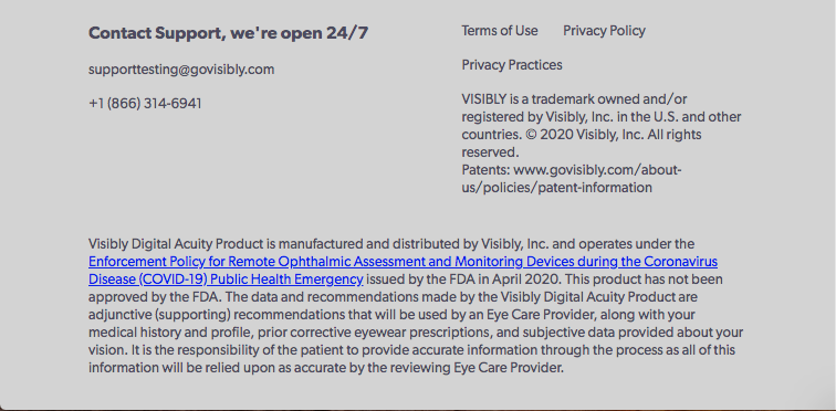
Bad
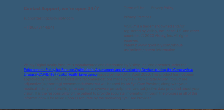
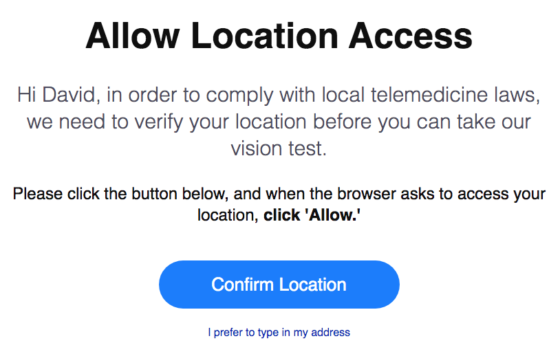
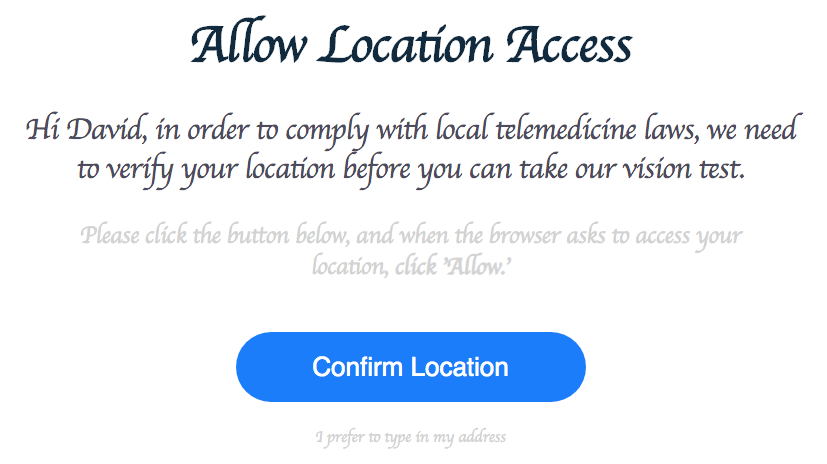
Font
What We'll Need | What it Impacts |
|---|---|
An open-source Open Web Font or Google Font. Must be a Sans-Serif font for readability | Font family on non-test related experiences: including headers, footers, and some onboarding descriptions. |
Hex code for main text color. Must be a dark, high-contrast color to ensure visibility. | Content text color on onboarding questions and Lite Site content. |
Hex code for link text color. Must be a easily-differentiated color for readability. | Link color |
Good
Bad
Primary and Secondary Colors
What We'll Need | What it Impacts |
|---|---|
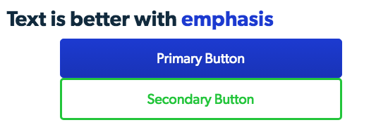
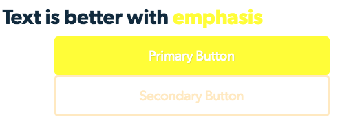
Hex codes for your primary and secondary color. Since these colors will be used in descriptive text, we highly recommend picking high-contrast, easy-to-read colors. | Onboarding Buttons and Emphasized text |
Good
Bad
Lite Landing Page
All Lite integrations come with a pre-built landing page in which your users can create an account and take the Visibly Vision Test. Since the Lite Landing Page is used to market people into your testing experience, it has additional aspects of customization available for your branding.
Other than the previously-described customization options, the following text and imagery is available for branding on the Lite Landing Page (highlighted in yellow):
Heading Content
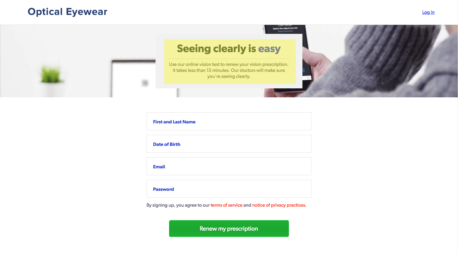
The title and subheading in the Heading Content block can be replaced with your own content. We'd recommend that the title text be less than a sentence (3-6 words) and the subheading be at max a paragraph long.
How it Works Content

The images and text within the How it Works section can be updated with your own content. For this section, each step be less than a sentence (3-6 words) and images must:
- Be 800x480 pixels in size
- Be readable when on mobile format (eg 200x120 pixel size)
- Have a transparent background
- If in color, be consistent with each other and the branding added to the page
Footer Content

The support email and phone as well as the terms and privacy policies can be updated to match your service. If footer content is updated to your own, you must go through support training with our customer support team to ensure successful managing of patient data and services.
Updated 8 months ago
