Marketing
Direct the user into the test experience.
User Education/Marketing will help your user discover and learn about the vision test. Most of your customers will never have done something like this before, so this stage needs to be as clear as possible to market the product and answer any questions/concerns that may arise at the beginning.
This flow is broken into two parts:
- Initial Entry: Point the user towards the test
- Landing Page: Excite and inform the user
Initial Entry
As users navigate your site, provide clear points of access for the user to order their vision test. Access should not be relegated to one page, but instead have consistent entry points throughout your shopping experience.
Some effective means of communicating the test for your users include, but are not limited to:
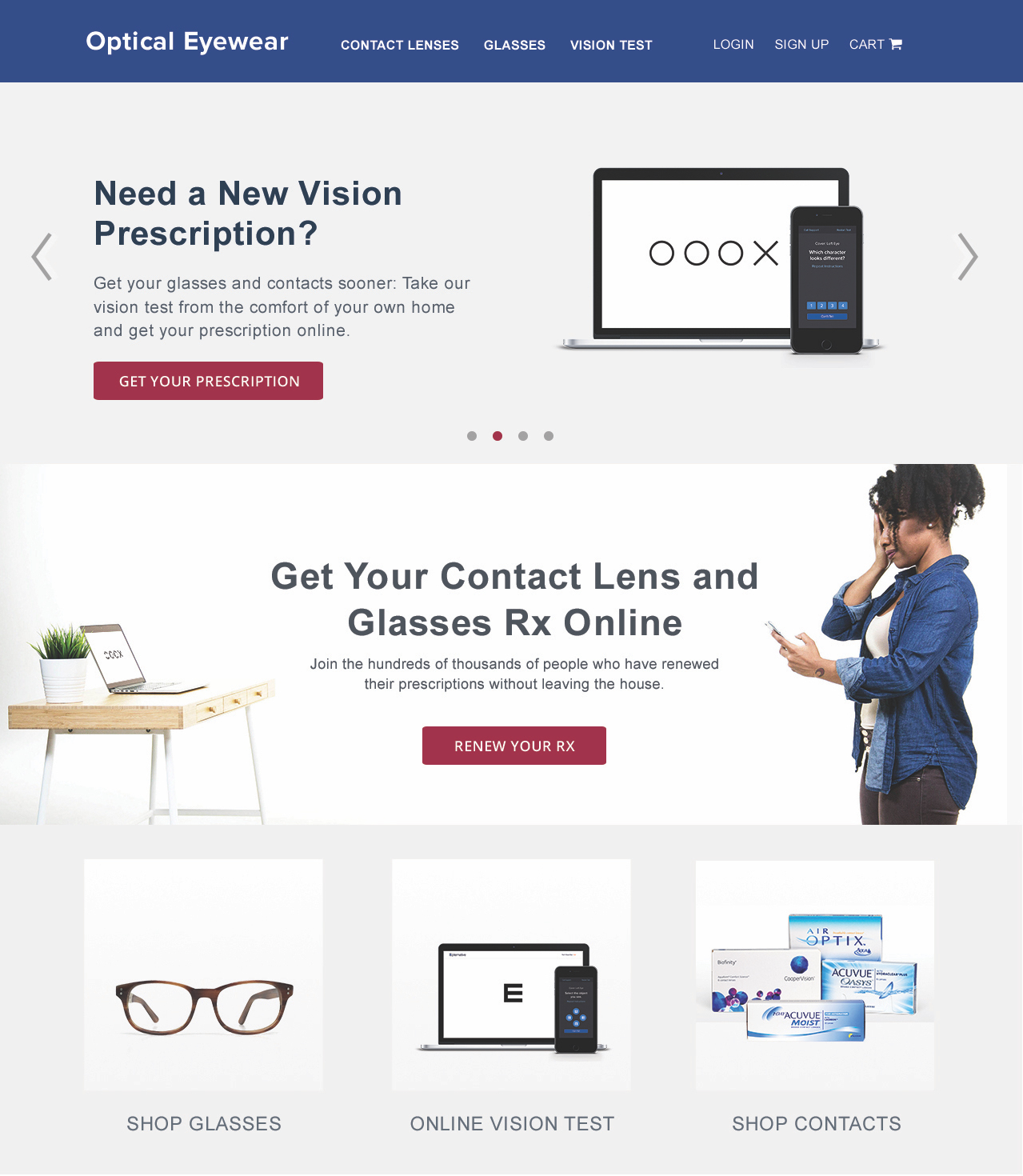
- A dedicated button on the main navbar keeps the vision test accessible on any page.
- A dedicated, static section underneath your hero image and/or a call to action button on the main page directs user attention to your new technology.
- If a main image carousel is being used on your site, adding a slide to advertise the test helps catch users as they begin browsing.
Marketing the test as a separate product on your products page is useful, but not necessary.
An example of Initial Entry on the main page of the site is shown below.

Ex. Initial Entry Page
Landing Page
Considering an online vision test may be a new concept to many of your users, you should have a landing page that provides a broad overview that excites and informs the user about the product. Think of this page as a full-page advertisement for a brand-new tech you’re selling – here’s your chance to show your users why an online vision test is the perfect product for them.
We recommend that your landing page contain the following sections:
Header Block
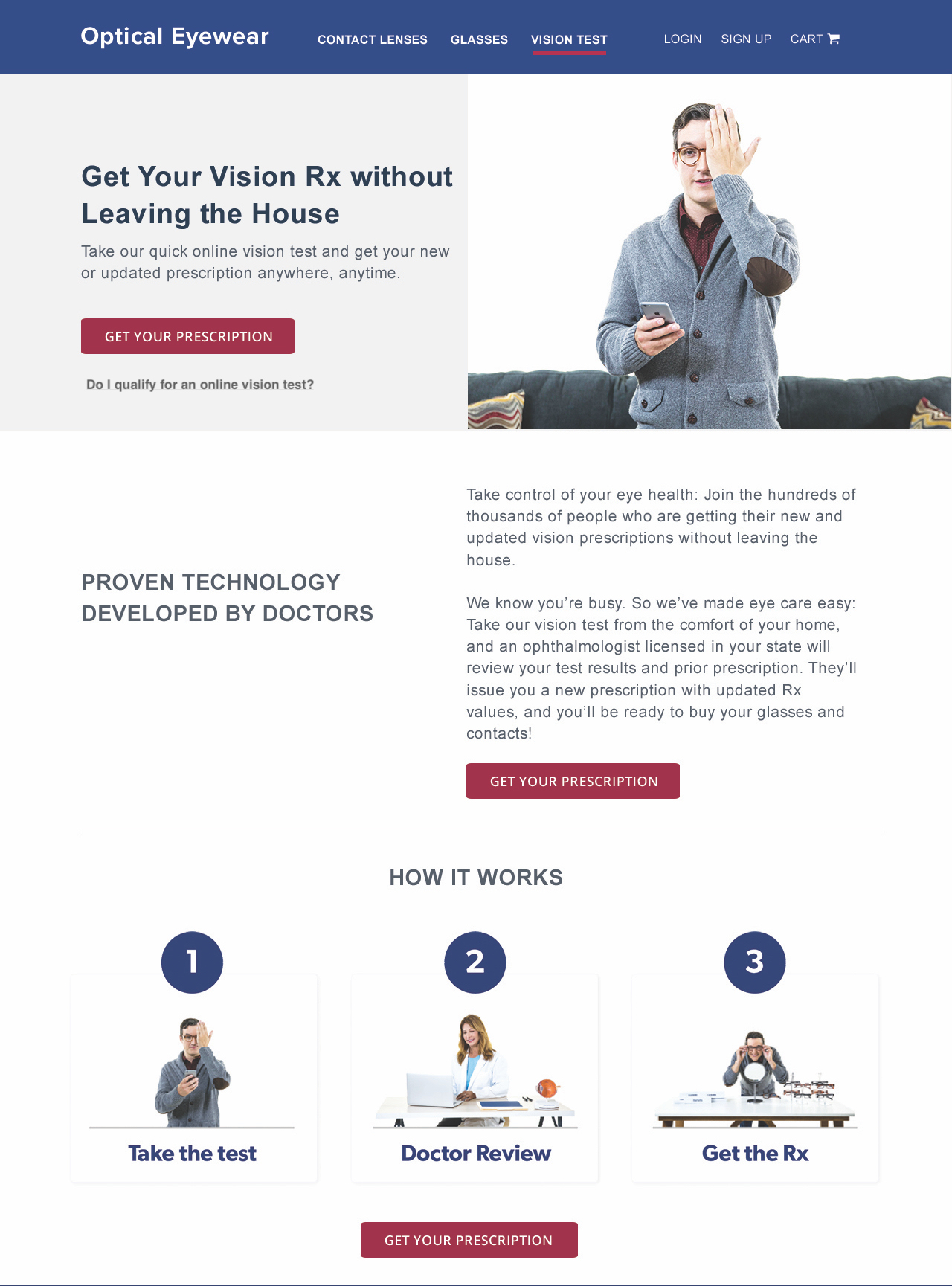
This is your call-to-action. Briefly summarize the highlights, the price, and the possible test types here. This should end with easy-to-see action button(s) that takes the user directly to the next step in their flow. Users should be able to use this block to quickly understand and jump into the vision test.
Detailed Steps
Call out what the test process looks like for the user. Use this block to explain how long the test will take, how the prescription is verified, and how long they have to wait for the test result. This helps answer common questions users have about their tests. It’s recommended to highlight that a licensed eye care professional (ophthalmologist/optometrist) in their state is reviewing their test.

Ex. Landing Page with Header Block & Detailed Steps
What You'll Need
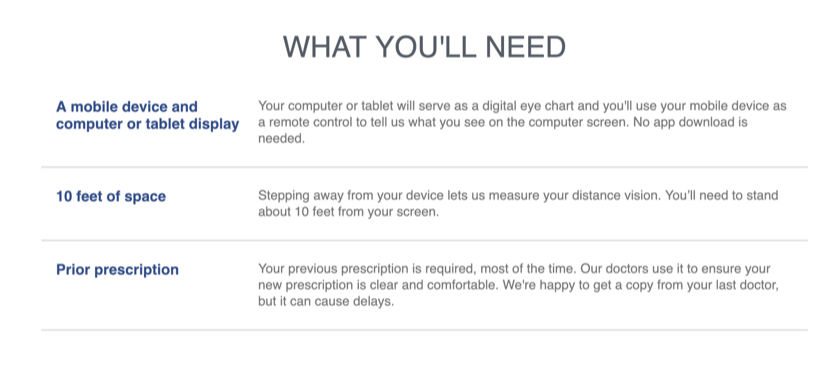
Users may be browsing your store in places not ideal for taking the test (e.g. via their phones, at work, on the bus), so this section helps prevent user dropoff when starting the test. You should mention that the test requires:
- A computer/tablet as the chart and a mobile device as the remote control
- 10 feet of space
- A prior prescription, most of the time. If the user is taking the test to renew their prescription a prior Rx is required.

Ex. What You'll Need Section
Benefits
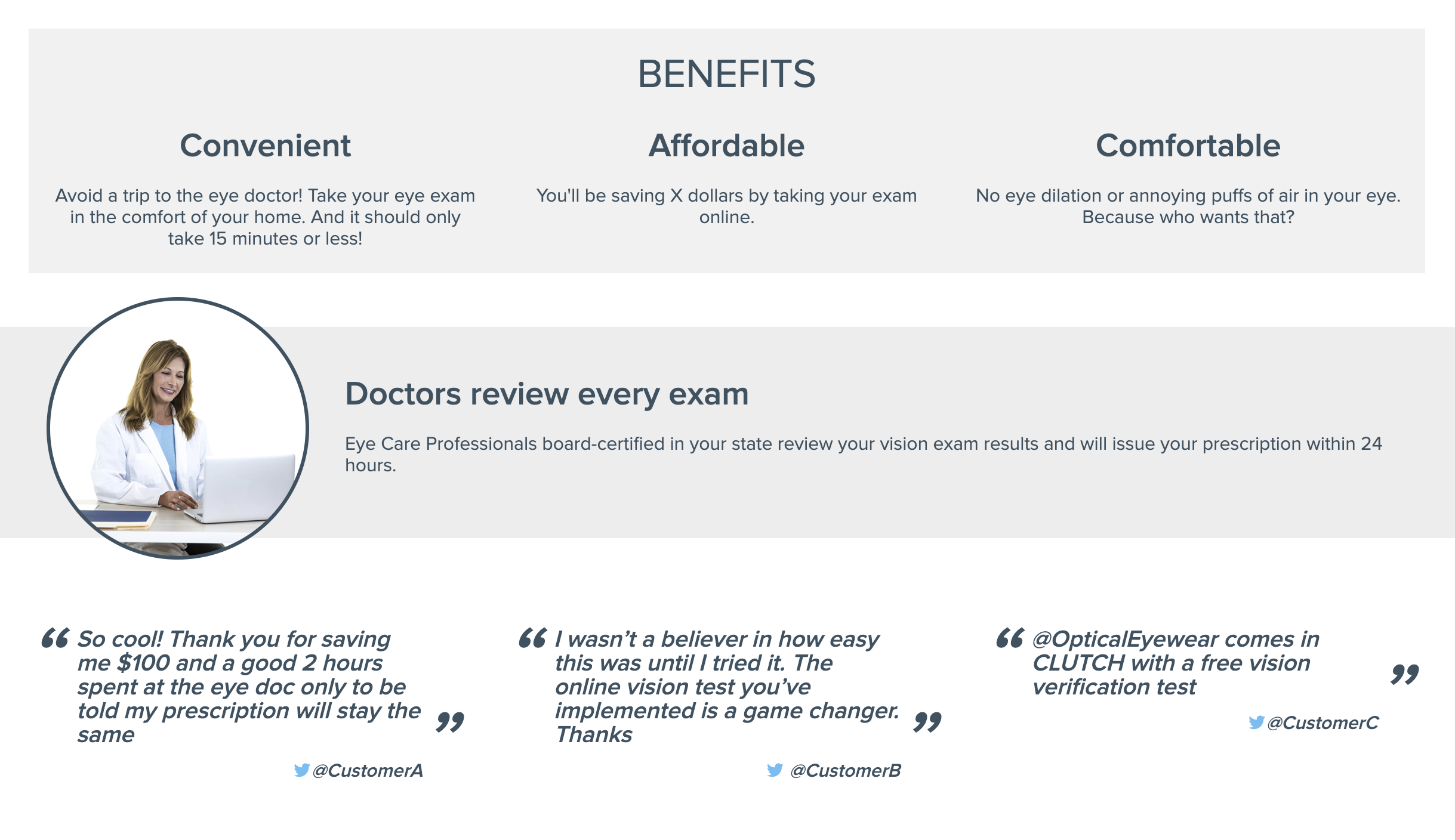
Use this section to point out what makes this test useful. Convenience, affordability, and comfort are top points to emphasize. Here’s a good place to put user reviews as well, to further solidify the utility of the product. This section is usually placed at the end of the page, to be mainly seen by the users who aren't fully sure about taking the test.

Ex. Benefits Section
Updated 7 months ago
